How many of you know that Google+ changed it’s whole look and the flow of the website ? 🙂
Everything looks more cool and easily accessible now with a nice fixed container look and a nice content scrolling in the middle that allows you to have all the things shown and always available on the users screen. The designers did an excellent job of enhancing the siteÔÇÖs usability.
I love the new look and the new design and a few new things which was added by Google within this last 6 months like cool Games , Trending on Google part , Explore option to see what’s new on Google Plus & what people are posting , option of keeping a cover photo (like on Facebook) but also allowing you to have a alternate way to display your own multiple Photos in place of that cover Photo and much much more 🙂
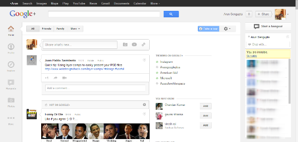
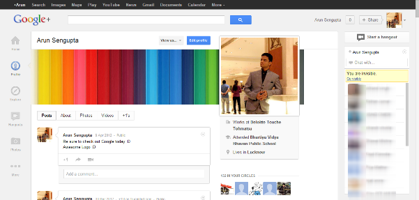
Here are some screenshots to let you know how it looks now, I know you guys must be thinking why post an image since we can always go to Google Plus and look for ourselves 😛
But just in case if they change something else or add something new , then I won’t be able to justify what I saw when I saw the changes made to the site 🙂
This is my Profile page (for now)

And this is the Default Homepage which comes right now on Google+

Well I surely hope you guys check out the Google’s New and Improved Social Experience 🙂 and don’t forget to let me know what you guys think of the changes and … off course my blog 😀
Take care and have a nice day.
