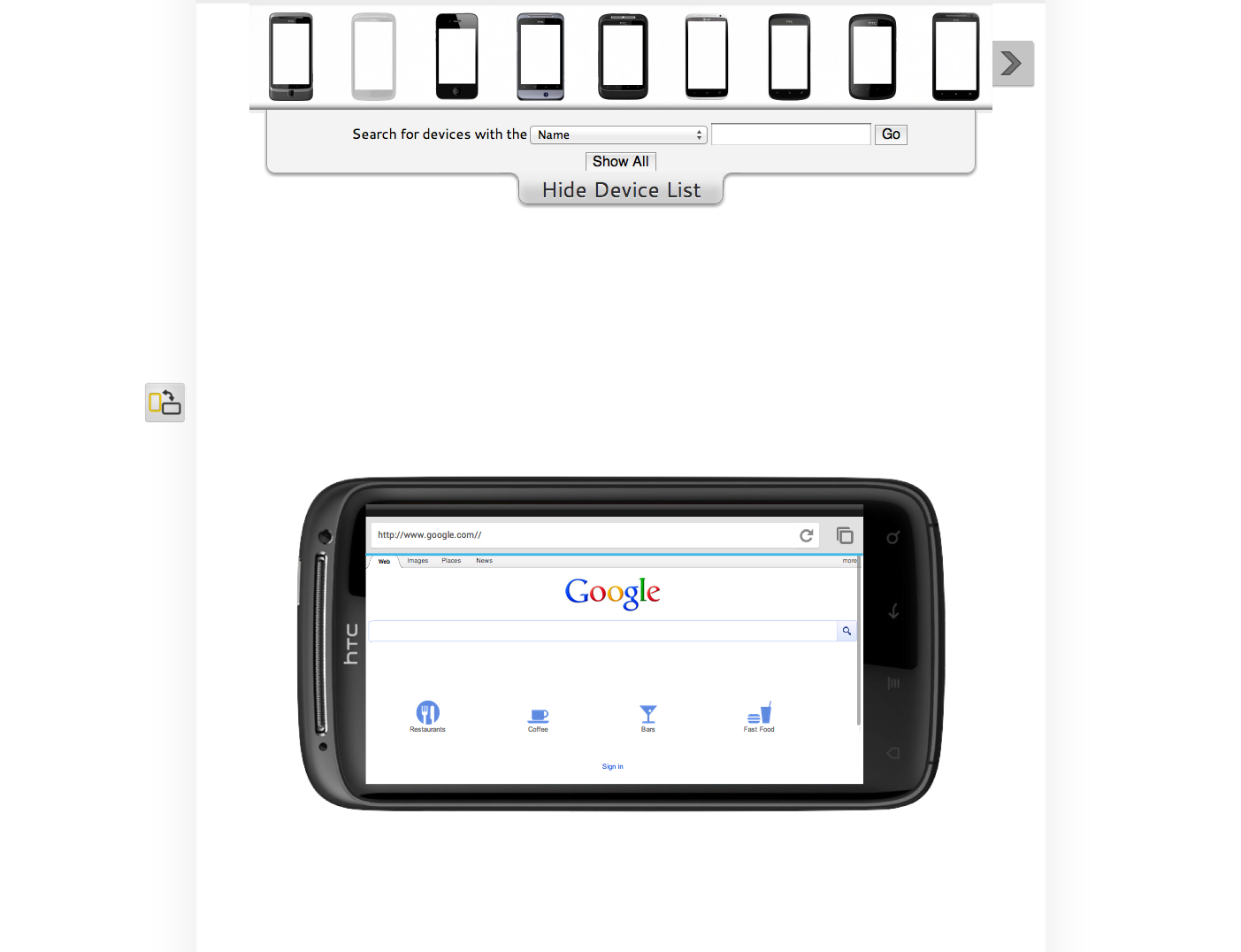
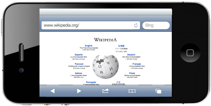
An up-and-coming online mobile device simulator, The Mobile Look lets you check your siteÔÇÖs design using a variety of different devices.
Unlike other online simulators it actually uses the correct mobile useragents ÔÇô small strings sent to the server when mobile devices request webpages. This means you actually see each page as it would be seen for real. The displays are also the correct number of pixels tall and wide for each device, so the webpage contents are laid out accurately.
The devices even behave like the real thing would with the right sized navigation bars as well as loading bars, address fields and reload buttons. You can rotate every device to landscape position too, to see the page in a different layout.
Most importantly, the device catalogue is always growing so youÔÇÖll always have quick and easy access to test your website on multiple devices. The owner of The Mobile Look even tells me thereÔÇÖs more to come such as webpage embedding and simultaneous viewing so watch out for these new features!

Site: The Mobile Look


hey, this looks great!
I know … hehe 🙂
Thanks a lot.
hehe… I know 😛
Thanks a lot.